Hello, pals! It’s once again time for the comicsweblogosphere’s favorite recurring feature, the Beginning of Civilization, where I go through the monthly Diamond Previews catalog and pick out the best items that we’re all looking forward to! So, grab your copy of the April 1991 Previews and follow along!
p. 29 – The Sandman Trade Paperback:
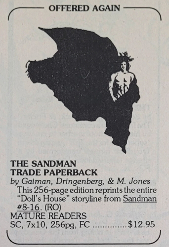
This one and only collection of the instant classic Sandman series is a must-have, and if you’ve got your copy yet, take advantage of DC’s making it available again! Mark my words, this is an eternal work of genius and nothing can ever possibly knock it from its lofty perch!
p. 47 – Knuckles the Malevolent Nun #1:
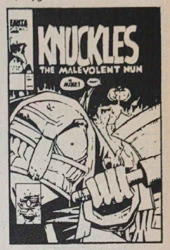
The Sonic the Hedgehog video game franchise is about to release its second installment in 1992, and we can get a sneak peek at his new sidekick Knuckles in this exciting comic book adaptation!
p. 69- Infinity Gauntlet #2:
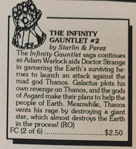
This is going to be the ultimate Marvel adventure, and absolutely won’t be overshadowed by any future reworkings in other media!
p. 72 – X-Force #1:
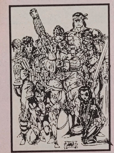
This is gearing up to be the most influential comic book of the 1990s, and we’re only a year in! The art style is the wave of the future, and be sure to grab your copy before it sells out, because there’s no way you’ll be able to walk into a comic shop 35 years from now and find just stacks of them sitting around!
p. 127 -Lucasfilm Fan Club #16:
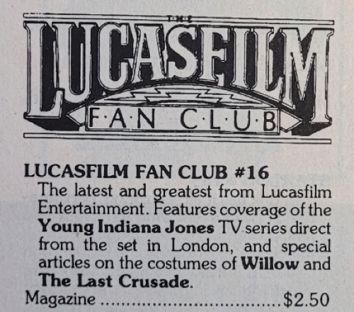
The fan base for Star Wars and other Lucasfilm properties are some of the most open-minded and imaginative people around, accepting of any changes or challenges to their expectations, and this magazine celebrates them and their love for these worlds!
p. 128 – Star Trek The Official Fan Club #80:

The fan base for Star Trek and other Paramount properties are some of the most open-minded and imaginative people around, accepting of any changes or challenges to their expectations, and this magazine celebrates them and their love for these worlds!
p. 133 – Watchmen Sourcebook:
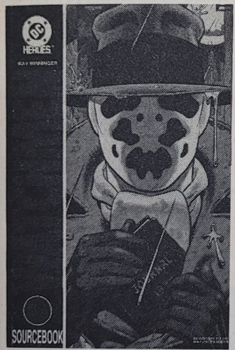
What an amazing role playing game resource for your favorite DC Comics superteam! Can Rorschach beat Batman? Could Dr. Manhattan stand up to Superman? Use the information inside to answer the questions even Alan Moore dared not to ask!
p. 143 – Marvel Super Heroes Tri-Fold Wallet:
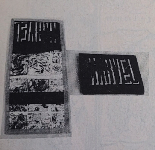
Perfect for slipping a twenty dollar bill inside so that you can buy up to 13 new Marvel comics during your next trip to the comic book store!
p. 154 – Dart Desert Storm Gulf War Fact Cards Set:

One of only seven different Desert Storm sets available in this month’s catalog! Be sure to load up, because what are the chances of this opportunity ever rising again?
p. 158 – Star Trek Episode Pin #17 Shore Leave:
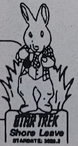
Identify yourself to your fellow Trekkies and/or Trekkers with what will surely become the universal symbol representing Gene Roddenberry’s greatest creation!
1. I definitely remember reading The Doll’s House as my first Sandman in my university library in the early 90s. (Interestingly, my gateway to Gaiman, as a rabid Alice Cooper fan, was his graphic novel interpretation of The Last Temptation).
2. I seem to remember Alan Moore, before the great divorce from DC, saying that the background material in the Watchmen RPG was actually ‘canon’ for the Watchmen story.
Oh, how I missed End of Civ!
Knuckles the Nun reminds me of that one guy from Cerebus. You know the one, the one who is based on an actor…with the eye!
I laughed, I cried, I felt very, very old.
Nicely done, sir.
We, as a nation, rejoice in this column.
I platonically love you, Mike.
This is why I read you blog every day — it reports all the latest red-hot news as soon as possible. I’ll keep a look out for that “Doll’s Cottage” magazine!
Hey Mike: have you ever done a post where it was just the ads and how freaky they were. Chemical sets, the Daisy rifile thing, your big piece of art that reads And then… KOREA! Or even some of the PSA’s.
I’d be curious as to when they ads started changing to more benign things instead of rifles you buy X-Ray specs or exploding gum. Just a thought.
Cassandra: for 20 years, I have loved Mike Sterling in a Kurt Russel kind of way, like if only we could shoot pool or the days I worked a shop in the 90s and how crazy that decade was.
Sort of like a Ben Affleck/Matt Damon thing.
Mike is a better angel. But damn if we need more scans of crappy ads that were ten on a page.
Wayne: I’d love for someone to do an analysis of ads in comics over the years and what it says about who the publishers/advertisers thought were reading the comics. Tracking what was advertised in Vertigo comics (so much music!) is a project I’d kind of like to do some day.
@Wayne
I am often pleasantly surprised when I stumble upon Public Service Ads in old DC Comics from the early ’60s which are anti-intolerance, or pro-education, pro-science, and pro-humanity…stuff about using local libraries, not dropping out of high school, or joining the Peace Corps. Neat stuff!
@Matthew Murray
My main question about Vertigo Comics is why do so many of them, especially from the ’90s, like Sandman: Mystery Theatre, seem to have flat, mundane coloring? Was it a conscious decision on their part? Was it considered “cool”? I wonder if it was what Matt Wagner asked for or if it was just David Hornung’s idea? I find it often detracts from the artwork and wish they had used a Tom Palmer or Klaus Janson coloring aesthetic instead.
Didn’t think I’d ever see Knuckles the Malevolent Nun again. Thanks, Mr. Sterling, for always being full of surprises. Also I can’t believe there were Desert Storm trading cards and that I had several packs.
Sean-Vertigo certainly did seem to be purposely going with a muted colour palette in order to set a certain mood. As someone who read every Vertigo title from the start, they were attempting to appeal to us Generation X teens who were perpetually depressed and listening to grunge music, and it succeeded. “These comics are surely as depressed as me. I can put down the Arthur Rimbaud and heroin and enjoy this non-funny book. Unironically.”
I used to post at this comic forum geared towards certain Vertigo comics, and one poster used to consistently make the joke that the one word that best described Vertigo was “brown”.
Sean: Draggin’? Compainin’? You need entertaining! And the D and the C are already there, even when it still had the old logo.
@ Chris V
Now I have a picture in my mind of you listening to “Golden Brown” by The Stanglers while you were reading Shade the Changing Man…but you were probably actually listening to “Burn It Clean” by Mudhoney …
but, yeah, “brown”–and mustard yellow–seems to adequately describe the Vertigo Comics color palette.
I, too, was a Gen X teen, although I tended to listen to X and Social D. while reading Love & Rockets…
@Wayne
Well, I certainly love pre-Crisis DC–the company whose comics I grew up reading! But it was a bummer when the DC Explosion turned out to be an implosion…
Oh man, I missed End of Civilization. This is great! Thanks for making the world a better place, Mike. :)
Hats off, man. This is incredible. (And mark me as another who misses those monthly End of Civ posts.)
“Star Trek Episode Pin #17 Shore Leave”
Giant Easter Bunny but NO FINEGAN? WHAT.
“My main question about Vertigo Comics is why do so many of them, especially from the ’90s, like Sandman: Mystery Theatre, seem to have flat, mundane coloring?”
I assumed that title was supposed to look like that!